
Role
UX Research
UX and UI Design
Tools
Figma
Lyssna (Usability Hub)
Zepelin
Lookback
Balsamiq
Octopus.io
Timeframe
4 weeks
Freelance
The client
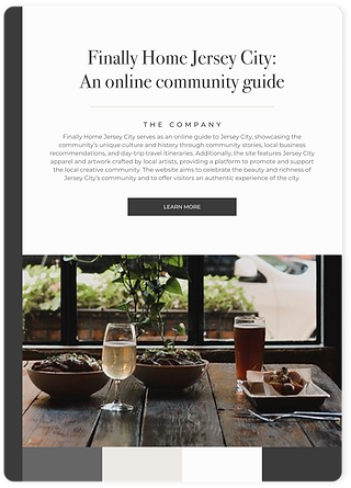
Finally Home Jersey City serves as an online guide to Jersey City, showcasing the community’s unique culture and history through community stories, local business recommendations, and day-trip travel itineraries. Additionally, the site features Jersey City apparel and artwork crafted by local artists, providing a platform to promote and support the local creative community. The website aims to celebrate the beauty and richness of Jersey City’s community and to offer visitors an authentic experience of the city.
Problem
Users face challenges in understanding the site’s purpose and navigation to specific content due to unclear navigation, ambiguous terminology, and frustration with the current filter functionality.
Solution
The website's homepage was redesigned to provide a clearer purpose, while a user-friendly navigation with dropdown categories was introduced. Branding was simplified, and an interactive map & guide were added to enable informed community exploration, resulting in increased engagement and satisfaction.

Simplified the landing page
Streamlined the layout and content of the landing page to provide a straightforward introduction to the website's offerings.
Refined the color palette and typography
Refined the color choices and typography to enhance visual coherence.
Redesigned the footer
Gave the footer a fresh design, ensuring it remains visually appealing while providing essential information and navigation options.
Developed a new navigation system
Created an updated navigation system that enhances user navigation efficiency throughout the website
Structured the content search flow
Organized the way users search for content to ensure a smoother and more intuitive experience.


Designed article cards
Created article cards that include essential details like the title, summary, publication date, and estimated reading time.
Revised the website terminology
Reframed the website's terminology to make it more familiar and easily understood by users.
Added a new feature
Incorporated a page that features neighborhood guides and an interactive map.

MY DESIGN PROCESS
For this project, I utilized a design thinking process to guide me through the development journey. This approach enabled me to stay focused on creating a solution that truly addressed the pain points identified through extensive user and market research.

Before diving into the redesign and feature addition, I needed to learn more about the pain points users were facing. This understanding would guide me in restructuring the site to enhance user navigation, improve the overall user experience, and establish clearer hierarchy within the site.
Understanding the stakeholder's goals and motivations
I conducted a stakeholder interview with the founder to learn more about the business, understand the business goals, and uncover motivations behind making these changes. Since the stakeholder would be also be taking on the role of the developer, I was also interested in gaining an understanding of any technical limitations or restrictions we would need to consider.
The stakeholder's goals for the redesign:
-
Create a sense of hierarchy within the website
-
Organize content
-
Drive user engagement and maximize retention
-
Design the interactive map and neighborhood guide feature
-
Increase the overall usability of the website
Uncovering users' behaviors and frustrations through usability testing
Despite recognizing the site’s navigation and organization as problematic, I wanted to specifically pinpoint the sources of user frustration by:
-
Identifying users’ first impressions when visiting the website.
-
Figuring out how people look for information on the website.
-
Finding out why people use the website.
-
Testing if the way the website is organized makes sense to people.
Gathering insights from competitive analysis
Exploring competitors' homepages and navigation systems provided me with valuable insights and guidance that shaped my design choices.
Opportunities gathered:
-
The “Explore” section displaying content subjects on the homepage allows users to see what type of content is available at first glance without having to navigate through the site.
-
Adding a search bar allows users to navigate to content quickly.
-
Adding a featured section with the newest and most popular articles will help drive user engagement.

Unveiling insights through Google Analytics
As I looked into the data provided by Google Analytics, fascinating patterns emerged, uncovering how users interact with the site. These findings were key to understanding user behavior and guiding the redesign efforts with a user-centric approach.
Key takeaways:
-
A need to maximize site visibility and first impressions to better leverage external referrals.
-
Prioritize the desktop experience to account for the 86% of users who access the site through desktop.
-
Solve navigational challenges to enhance user engagement and reduce drop-offs.
After creating an affinity map based on participant responses from the usability test and synthesizing all of the research, I began to better understand the users and their frustrations while using the site.
Pinpointing points of frustration.
By looking at the usability test results and google analytics report, I found that these were the areas of the website that were causing users the most frustration. During this redesign, I would need to address these issues, refine branding, and design the new map feature.


Now that I had a good idea of what was causing users frustrations, I was able to begin to ideate a new structure for the site as well as determine how I could implement the new map feature.
Creating a visual site map with octopus.io
To establish a new structure for the site, I created a visual site map. Utilizing a visual site map instead of a traditional one proved beneficial in presenting my ideas to the client. It also helped me conceptualize the new structure before moving on to sketching.

From sketches to mid-fidelity wireframes
After reworking the information architecture of the website, I then began to draw up some initial sketches to determine the layout of the key screens. Given that 86% of users access the site via desktop, I focused my efforts on refining the desktop experience first.
After settling on a layout, I transitioned to Balsamiq to create mid-fidelity wireframes then to Figma to build out the high-fidelity wireframes. During this time, many iterations took place as I incorporated feedback from peers, my mentor, and the stakeholder.

-p-2600.png)
After receiving approval from the stakeholder, I was prepared to proceed with high-fidelity wireframing. However, before advancing, I needed to refine the brand guidelines. The stakeholder expressed feeling overwhelmed by the current system, citing numerous font choices and colors.
Refining the brand guidelines
To streamline the redesign process and empower the stakeholder, I simplified the branding. These guidelines not only guided the redesign but also set a strong foundation for future site developments, facilitating an efficient design process.


After I was finished with both the mobile and desktop high-fidelity wireframes as well as the desktop prototype, it was time to test the product with users by conducting a second usability test. The test would be the same test used in the initial usability test, and the results would be compared to assess success.
Evaluating the success of website redesign
The objective of this research was to assess the success of the new website design by determining whether the hierarchy and usability of the site had been improved. Success was determined by achieving a higher success rating compared to the initial usability test. Based on the findings of this usability test, the redesign was successful in improving the hierarchy and usability of the site.
-3.png)
Sending the deliverables to the client
The final Figma file containing the design system, high-fidelity wireframes, prototype, and instructions on how to use Figma were sent to the stakeholder to carry out the development of this redesign (you can view the file here). In addition to a Figma file, I also set up a Zepelin account to make the development process easier for the stakeholder.
Conclusion
This project was especially rewarding because I had the opportunity to work on a website that showcases the beauty and uniqueness of the city I call home. For me, this emotional connection added an extra layer of motivation and dedication to my work.
During my time in the DesignLab bootcamp, I was used to taking on projects as an individual. While this allowed me to develop a strong sense of self-reliance and problem-solving skills, it also meant that I sometimes missed out on the collaborative aspects of real-world projects. Therefore, the opportunity to collaborate with a client on this project was a refreshing dynamic. It introduced me to a new level of teamwork, communication, and mutual understanding.