Tools
Figma
Lyssna (Usability Hub)
Balsamiq
Role
UX Research
UX and UI Design
Branding
Timeframe
80 hours
DesignLab- 2023
Problem
Dating app users face concerns about security, challenges in finding matches aligned with relationship goals, limited interaction opportunities between matches, difficulties in assessing chemistry, user fatigue, and the time-consuming nature of profile creation.
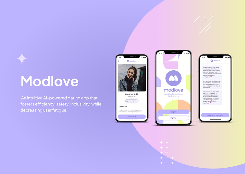
Solution
An AI-based dating app, addresses the evolving needs of dating app users. Designed with intuitive features, it offers a less time-consuming alternative compared to other apps in the market. Modlove prioritizes safety, inclusivity, and tackles user fatigue, redefining the dating app experience.

Effortless Account Creation
Modlove simplifies account access through phone verification, eliminating the need to manage login details, catering to the frequent deactivation and reactivation patterns of dating app users.
Enhanced Safety Measures
To ensure utmost security, users are required to verify their accounts by uploading a photo of their ID and a selfie, bolstering the platform's safety and security standards.
Flexible Profiles
Users have the freedom to customize their profiles, adding as much or as little information as desired.
AI Match Assistant
Amora, the personal match assistant offers match recommendations and valuable dating tips.
SoulQuotient
This brief personality quiz helps Amora comprehend the user's personality and preferences, resulting in a personality summary and tag words showcased on the user's profile.


User Fatigue Reduction
Modlove replaces swiping with curated matches, providing deeper insights into match personalities, and alleviating user fatigue.
Social Media Integration
Users have the option to enrich their profiles by seamlessly linking their Spotify, Instagram, and CoStar accounts, providing a more comprehensive representation of their interests and personality.
My Design Process
For this project, I utilized a design thinking process to guide me through the development journey. This approach enabled me to stay focused on creating a solution that truly addressed the pain points identified through extensive user and market research.

Research
Exploring the Problem
Motivated by TV shows like Million Dollar Matchmaker, Married at First Sight, Indian Matchmaking, and Jewish matchmaking, I began to consider how this age-old practice could be adapted to the modern world. After researching different popular dating apps, I noticed that the current products on the market do not take into account the factors that people look for in a relationship, such as personality and compatibility.
In this project, I wanted to explore the problems that users experience when using popular dating apps and determine what they are actually looking for in a potential match to help build a better platform that is less time-consuming and more intuitive to the user.
Understanding assumptions and risks
When interviewing participants, I wanted to approach discussions on dating history and goals with care, as they can be sensitive. I recognized that participants may find it challenging to share experiences, and that individuals may have diverse motivations and goals for using dating apps.
Target Audience

Millennials aged 25-35, seeking meaningful connections and proficient with dating apps.
Gathering user research through interviews
I conducted user interviews with five participants who either currently use or have used dating apps in the past.
During this research phase, I wanted to understand:
-
Study competition in online dating, noting strengths and weaknesses.
-
Investigate users' past online dating experiences, including duration, platforms used, and feedback.
-
Identify challenges and frustrations users encounter with dating apps.
-
Examine users' preferences for app features, considering pros and cons.
-
Understand users' dating goals and motivations for using dating apps.
-
Uncover challenges and frustrations users encounter in dating.
-
Gain insight into users' preferred communication styles with matches.
Gathering insights from competitive analysis
In addition to analyzing the most popular dating apps, I wanted to gain a better understanding of how traditional matchmaking works and whether these principles could be incorporated into my designs.
Opportunities gathered:
-
Draw inspiration from Hinge and Tinder for safety features.
-
Develop an app inclusive of diverse relationship goals, with filter options.
-
Personalize the experience to save time, catering to busy college students and young professionals.
-
Offer fewer but higher-quality matches to reduce user fatigue.
-
Match individuals based on preferences, values, goals, and personality for a personalized experience.
-
Tailor profile length to user preferences: more extensive for serious seekers, streamlined for casual daters.

Defining the Problem
Defining pain points through affinity mapping
I was able to identify five key pain points that were experienced by most participants.
-
Lack of security or safety when using dating apps
-
Insufficient interaction between matches
-
Experiencing user fatigue and periodically deleting the dating app
-
Difficulty finding matches with comparable relationship goals
-
Profile creation being too time consuming

Ideation
Using "How might we" questions to guide ideation
Using my "how might we questions" (HMW) questions as prompts, I generated eight ideas in eight minutes. I find that this approach helps me to avoid overthinking my ideas and think more creatively. The ideas highlighted in yellow are the ones I chose to explore further.

Information Architecture
Prior to sketching screens, I wanted to establish the sequence of each task I would develop. Given the 80-hour time limit for this project, I decided to create task flows for the most common and frustrating problems that users encountered.


Lo-fidelity wireframes with balsamiq

Testing
Evaluating my designs by usability testing
To test my designs, I conducted 12 unmoderated usability tests via UsabilityHub. These were my metrics of success:
-
Success rate (whether users can perform the task at all)
-
The time a task requires to complete
-
The time a task requires to complete
-
Single Ease Question (SEQ)
-
Users' satisfaction
Prioritizing iterations using the Impact-Effort Matrix.
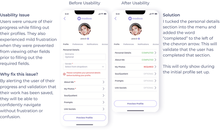
Before moving on to iterations, I considered the best method for the project. Initially, I leaned towards a severity scale, but usability testing feedback led me to realize its limitations. Time constraints prevented addressing all suggestions, so I opted for the impact-effort matrix to prioritize fixes with the greatest design impact.


Design
Designing a bold and modern brand identity
I wanted to create a brand that combines bold, eye-catching design with user-friendly simplicity. Representing boldness, trendiness, and youthfulness, the brand consists of a single accent color, a vivid purple, alongside occasional bright pastels for added interest. User interviews influenced a simple, flat UI design focusing on functionality, clarity, and minimalism.

Conclusion
I thoroughly enjoyed working on this project, particularly the user interviews and data analysis, which provided valuable insights into user preferences. I'm passionate about improving products that facilitate connections, and I see immense potential for growth in the dating app industry. While I focused on key tasks within the 80-hour constraint, I look forward to revisiting this project to further develop AI features and messaging functionalities. For those interested, I encourage exploring the detailed research analysis I've compiled. Thank you for the opportunity, and I'm excited to see how this project evolves in the future.